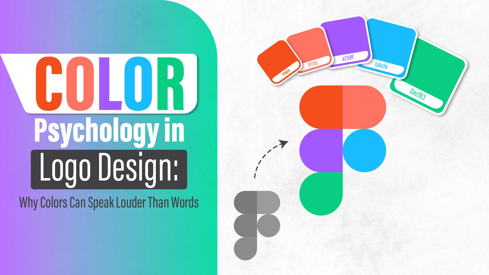
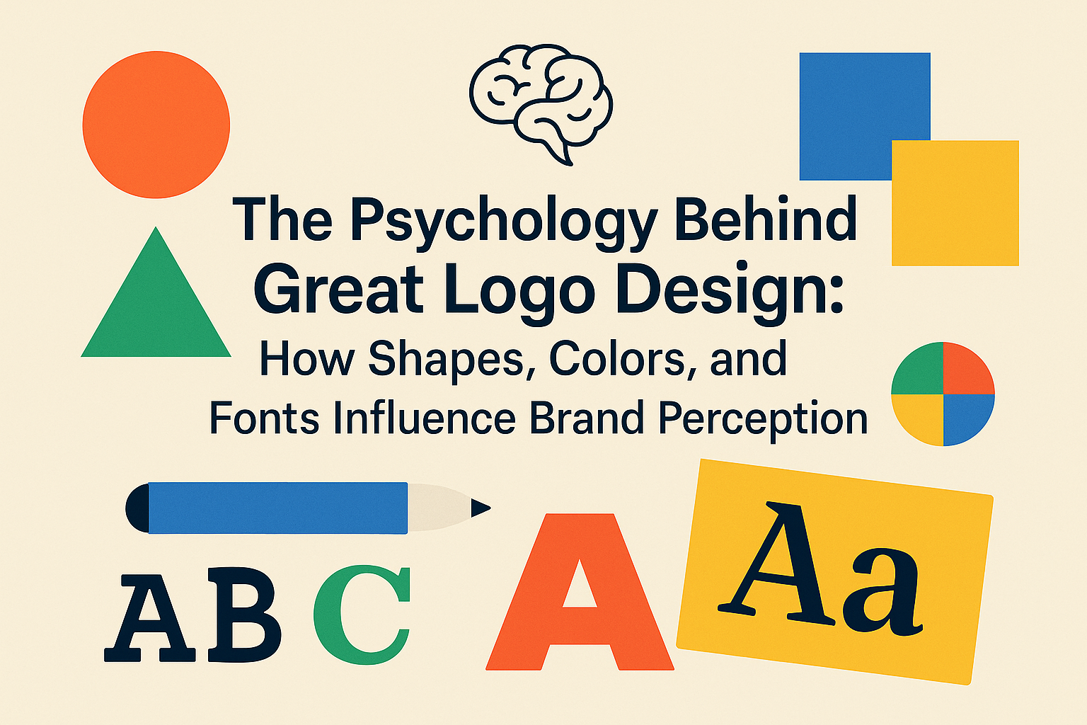
Color is more than just a visual element in design; it’s a powerful communication tool that conveys emotions, values, and messages. In logo design, the choice of color can significantly influence how a brand is perceived. Understanding color psychology is essential for creating a logo that resonates with your target audience and effectively communicates your brand’s identity.
🌈 Understanding Color Psychology in Branding
Color psychology examines how different hues affect human behavior and perception. In branding, colors are strategically used to evoke specific emotions and associations. For instance:
- Red: Often associated with energy, passion, and urgency. Brands like Coca-Cola and Netflix use red to grab attention and evoke excitement.
- Blue: Conveys trust, professionalism, and calmness. It’s a popular choice for tech companies and financial institutions, such as IBM and PayPal.
- Green: Symbolizes growth, health, and tranquility. Brands like Starbucks and Whole Foods use green to emphasize natural and eco-friendly values.
- Yellow: Represents optimism, warmth, and clarity. McDonald’s and IKEA utilize yellow to create a cheerful and inviting atmosphere.
- Black: Denotes sophistication, elegance, and authority. Luxury brands like Chanel and Nike often use black for a sleek and timeless look.
Understanding these associations helps in selecting colors that align with your brand’s message and values.
🖌️ Choosing the Right Color Palette for Your Logo
Selecting the appropriate color palette involves more than personal preference; it requires a strategic approach:
- Define Your Brand Identity: Understand your brand’s core values, mission, and the emotions you want to evoke.
- Know Your Audience: Consider the demographics, preferences, and cultural backgrounds of your target audience, as color perceptions can vary across cultures.
- Analyze Competitors: Study the color schemes of competitors to differentiate your brand while staying relevant in your industry.
- Test and Iterate: Create multiple color variations and gather feedback to determine which palette resonates best with your audience.
For professional assistance in crafting a color palette that embodies your brand’s essence, explore our logo design services.
🎯 The Impact of Color Combinations
Combining colors effectively can enhance the visual appeal and clarity of your logo. Here are some common color schemes:
- Complementary Colors: Colors opposite each other on the color wheel (e.g., blue and orange) create high contrast and vibrant designs.
- Analogous Colors: Colors adjacent on the color wheel (e.g., blue, blue-green, and green) offer harmonious and pleasing combinations.
- Triadic Colors: Three colors evenly spaced on the color wheel (e.g., red, yellow, and blue) provide a balanced and dynamic palette.
Choosing the right combination depends on the desired emotional response and brand personality.
🧠 Psychological Effects of Specific Colors
Delving deeper into individual colors:
- Red: Stimulates appetite and creates a sense of urgency, making it effective for food and retail industries.
- Blue: Promotes a sense of security and reliability, suitable for healthcare and corporate sectors.
- Green: Associated with nature and tranquility, ideal for environmental and wellness brands.
- Yellow: Evokes happiness and attention, often used in children’s products and entertainment.
- Black: Conveys luxury and sophistication, commonly used in high-end fashion and technology.
Understanding these effects ensures your logo communicates the intended message.
🌍 Cultural Considerations in Color Selection
Colors can have different meanings across cultures. For example:
- White: Represents purity in Western cultures but is associated with mourning in some Eastern cultures.
- Red: Symbolizes luck in China but can signify danger in other contexts.
Being mindful of cultural interpretations is crucial for global brands to avoid miscommunication.
🛠️ Tools for Selecting Your Logo Colors
Several tools can assist in choosing the right color palette:
- Adobe Color: Offers color wheel and palette generation features.
- Coolors: Provides quick and easy color scheme generation.
- Canva Color Wheel: Helps in understanding color relationships and harmonies.
Utilizing these tools can streamline the color selection process.
📈 Case Studies: Successful Logo Color Implementations
- Coca-Cola: Uses red to evoke excitement and passion, aligning with its brand identity.
- Facebook: Employs blue to convey trust and reliability, resonating with its social networking platform.
- Starbucks: Incorporates green to reflect growth and a connection to nature, emphasizing its commitment to sustainability.
These examples demonstrate the strategic use of color in reinforcing brand messages.
✅ Conclusion
Choosing the right colors for your logo is a critical step in establishing a strong brand identity. By understanding color psychology and considering cultural nuances, audience preferences, and industry standards, you can create a logo that effectively communicates your brand’s values and resonates with your target audience.
Ready to craft a logo that captures your brand’s essence? Explore our logo design services to get started.


