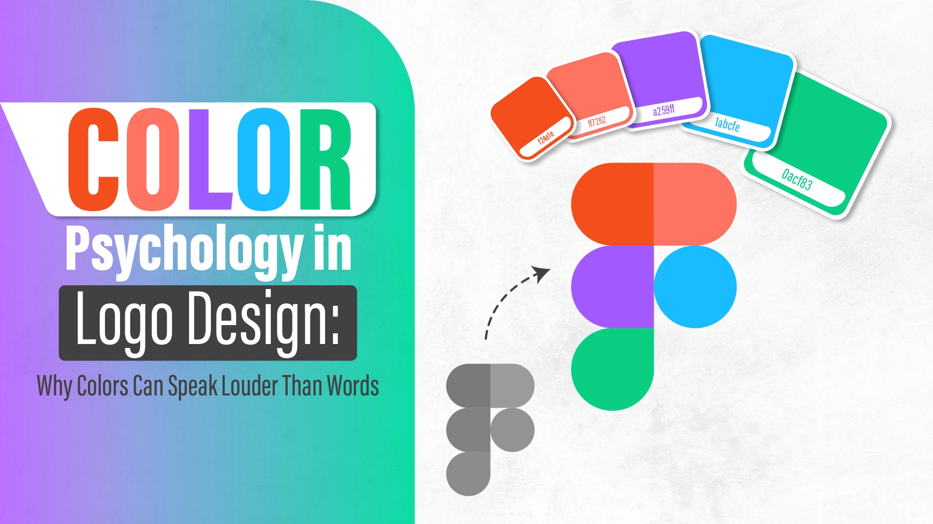
In today’s hyper-competitive market, first impressions can make or break your brand—and often, your logo delivers that impression in mere seconds. A well-crafted logo not only represents your brand visually but speaks directly to your audience’s subconscious using the powerful tools of color psychology, shapes, and typography.
In this comprehensive guide, we’ll explore how each design element plays a crucial role in communicating your brand message—and how understanding the psychology behind great logo design can lead to stronger brand recognition, trust, and customer loyalty.
🎯 Looking to create a memorable, psychology-driven logo? Explore our Logo Design services →
Why Psychology Matters in Logo Design
At the heart of every powerful logo lies psychological influence. Every curve, color, and letter form contributes to how a customer feels about your brand—even before they learn what you offer. When done correctly, a logo becomes a silent ambassador of your values, professionalism, and reliability.
- 90% of snap judgments about products are based on color alone
- Consumers typically take less than 10 seconds to form an impression of a brand logo
- Simple logos are 13% more likely to get consumer attention
Understanding the “why” behind the “what” helps you design more intentionally—and successfully.
The Psychology of Shapes in Logos
Shapes are not just visual elements—they’re emotional triggers. Different shapes subconsciously convey different messages and emotional responses.
1. Circles, Ovals & Ellipses
- Meaning: Unity, protection, community, eternity
- Why it works: Circles have no beginning or end. This creates feelings of wholeness and timelessness.
- Examples: Pepsi, BMW, Mastercard
✅ Best for: Community-driven brands, social networks, wellness, or global organizations
2. Squares and Rectangles
- Meaning: Stability, trust, reliability, order
- Why it works: These shapes suggest honesty and practicality—ideal for institutions and corporations.
- Examples: Microsoft, BBC, American Express
✅ Best for: Tech companies, banks, education, and architecture firms
3. Triangles
- Meaning: Progress, innovation, ambition, power
- Why it works: Triangles convey action and dynamic energy, especially when pointing upwards.
- Examples: Adidas, CAT, Google Drive
✅ Best for: Startups, energy brands, construction, and finance
4. Lines (Vertical, Horizontal, Diagonal)
- Vertical = Strength, growth
- Horizontal = Calm, tranquility
- Diagonal = Action, tension, movement
🧠 Need help choosing the perfect shapes for your brand? Let our experts guide you →
The Psychology of Color in Logos
Color is the most powerful emotional tool in logo design. It affects how your audience feels and what they remember.
| Color | Emotion / Meaning | Common Industries | Example Brands |
|---|---|---|---|
| Red | Energy, passion, urgency | Food, retail | Coca-Cola, YouTube |
| Blue | Trust, calm, professionalism | Tech, finance | Facebook, Intel |
| Green | Growth, nature, peace | Health, sustainability | Whole Foods, Animal Planet |
| Yellow | Optimism, clarity, warmth | Retail, leisure | McDonald’s, Nikon |
| Black | Luxury, power, sophistication | Fashion, auto | Chanel, Nike |
| White | Purity, simplicity, balance | Tech, wellness | Apple, Adidas |
| Orange | Creativity, confidence | Food, sports | Fanta, SoundCloud |
| Purple | Royalty, creativity, imagination | Luxury, education | Cadbury, Hallmark |
💡 Tip: Use no more than 2-3 core colors for clarity and visual balance.
🎨 Want a color palette that reflects your brand values? Work with our logo design team →
The Psychology of Fonts in Logos
Fonts aren’t just style choices—they speak volumes. Typography gives your brand a voice, and different font families appeal to different personalities.
1. Serif Fonts
- Feel: Traditional, trustworthy, established
- Best for: Law firms, editorial, finance
- Examples: Vogue, Time, Harvard University
2. Sans-Serif Fonts
- Feel: Modern, clean, accessible
- Best for: Tech, startups, e-commerce
- Examples: Google, Spotify, Microsoft
3. Script Fonts
- Feel: Elegant, personal, high-end
- Best for: Fashion, art, events
- Examples: Coca-Cola, Cadillac
4. Display Fonts
- Feel: Unique, bold, creative
- Best for: Entertainment, media, products
- Examples: Disney, Lego
✍️ Choosing the right typography can make or break your brand personality. We can help tailor your typography →
Case Studies: Psychology in Action
✅ FedEx
- Hidden arrow in the negative space (between E and X) = speed, precision
- Color psychology: Purple (trust + creativity) and orange (energy)
✅ Nike
- Shape: The Swoosh = motion, progress
- Font: Bold, simple
- Color: Black = strength, power
✅ Spotify
- Shape: Circle = unity, modern tech
- Color: Green = growth, freshness
- Font: Clean, sans-serif = simplicity
Simplicity, Versatility, and Scalability
The best logos are:
- Simple: Easy to remember
- Timeless: Not overly trendy
- Scalable: Looks great at all sizes
- Versatile: Works in black & white, color, and across platforms
🎯 Is your logo ready for all screen sizes and platforms?
Get a future-proof logo with Infuse Digitals →
Responsive and Adaptive Logos
With mobile-first branding, logos now need to be responsive—scaling and adapting seamlessly across web, print, and social platforms.
- Responsive logos shrink or simplify for smaller screens
- Animated logos engage more deeply in digital branding
🔄 We create logos that perform flawlessly across all digital landscapes. Start your logo journey here →
Common Mistakes in Logo Design
Avoid these psychological missteps:
- Overcomplication: Too many elements dilute meaning
- Clashing colors: Disrupts emotional harmony
- Trendy fonts: Date quickly and lose credibility
- Lack of cultural sensitivity: Some colors and symbols vary in meaning
🛑 Don’t fall into these traps. Let our design team get it right the first time →
The Role of Strategy in Logo Design
A great logo is rooted in:
- Market research
- Target audience analysis
- Competitor analysis
- Brand positioning
At Infuse Digitals, we don’t just design—we build a logo strategy aligned with your business goals.
Final Thoughts: Design with Meaning
A logo is not just a design—it’s your brand’s handshake, face, and voice in one. By understanding the psychological impact of shapes, colors, and typography, you can create a logo that not only looks great—but also feels right to your audience.
📌 Ready to create a logo that drives recognition and trust?
👉 Partner with Infuse Digitals →


